
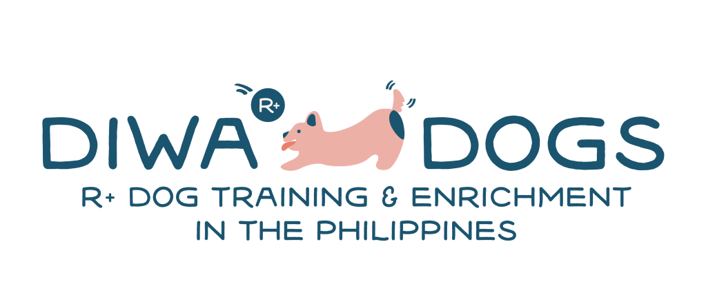
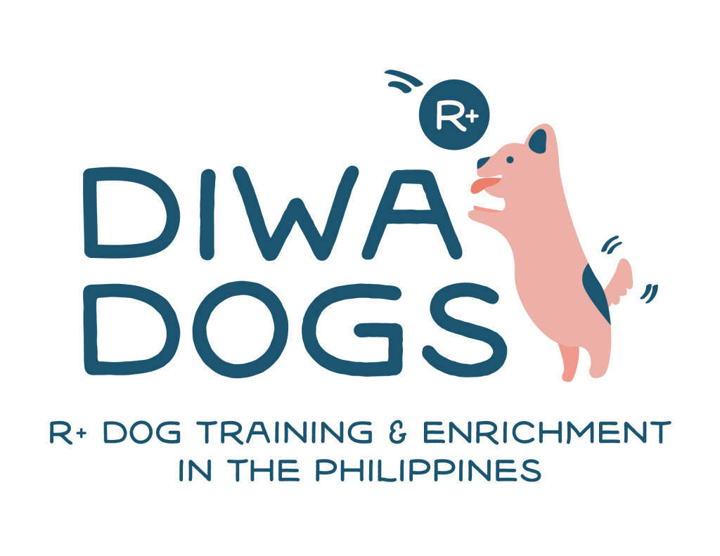
I’ve been wanting to give the Diwa Dogs logo a sprucing up, so you can just imagine the giddiness and joy I felt as I updated my website banner, profile pictures, and avatars with this new look! ✨
As I enter my second year as a credentialed R+ trainer, I needed my logo to be even more relevant to my voice and advocacy, to be cleaned up and enhanced, to look great on anything I slap it on to—website, social media, invoices, certificates, and more.
It’s just as important to me that it doesn’t deviate too much from the original look.
This is because the little pink dog that you first saw on Diwa Dogs was my 13-year old daughter’s work.
The story behind the logo
I was preparing to launch Diwa Dogs when I entered the kids’ bedroom to ask if my daughter, Holly, could create a logo.
She was very unsure about it, and understandably so, because she felt she didn’t have a lot of experience drawing or coloring animals.
I encouraged her to give it a try, to think of Windy eagerly doing tricks for treats, and to choose colors based on a palette I saw on Instagram.
Thankfully, Holly came through with both a logo and a banner that truly captured what Diwa Dogs was about:
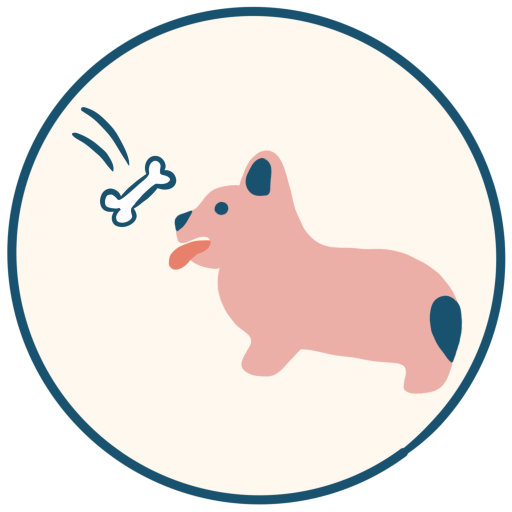
- A pink Corgi smiling at the sight of a “bone” that represents reinforcement
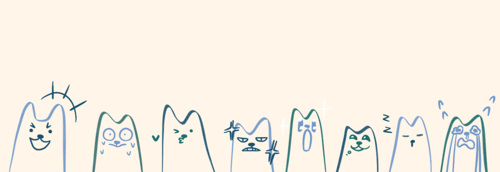
- A series of expressions that represent the importance of reading dog body language and that dogs are sentient beings
Rarely do I feel an instant connection with a logo on the first try, so I was very proud of her and how far she’s come as a growing artist.
Preparations for Year 2
When it came time for me to buckle down and decide where I’m headed in Year 2, I knew I wanted to take Holly’s work and improve it significantly, so it’d grow alongside my being a trainer.
I was super unsure of who to ask, so I posted a ‘call for help’ in the Learn R+ Fear-free Training in the Philippines community on Facebook.
The owner of Jhung Visuals and mom to my previous ‘student’ Coco, was so kind to offer to take a look at Holly’s work and improve on it.
We had a coffee chat a few weeks ago where we talked about Diwa Dogs, the branding I’ve established so far, and her process as a designer.
She wanted us to preserve Holly’s style, which I LOVE and definitely want for this new logo, and add a hint of playfulness. It felt reassuring to know we nailed down our branding from the get-go!
The final output is the same adorable pink long-bodied dog offering behaviors like standing or bowing for reinforcement. It embodies the confidence and agency I’m always looking for when working with a dog.
If you’ll notice, the dog also has a tail! I love the addition of the tail because Sappho, my senior dog, shows her love and excitement through her eyes and tail. It’s also one of the dog’s body parts that we look at when reading body language.
Finally, the logo came with a badge design, two variations of the horizontal banner, and a site icon I find myself using on most of my socials. 😍
I’m so happy with the final enhancements and feel twice as confident in Diwa Dogs’ direction now that we’ve wrapped this project up.
Happy training! – Stef, Diwa Dogs 🐾

Leave a comment